Advanced Elements - Using Shortcodes with Best Practices
| Site: | College of the Rockies - Online |
| Course: | COTROnline Faculty Help Manual |
| Book: | Advanced Elements - Using Shortcodes with Best Practices |
| Printed by: | Guest user , |
| Date: | Wednesday, 22 January 2025, 3:15 PM |
Introducing Shortcodes
The Moodle New Learning Theme comes with an embedded shortcodes feature to enhance your text elements in your course.
The following subchapters will review some of the most useful shortcode options that you can use. (Shortcodes covered in this book are the ones in bold below).
The key rule of shortcodes is that they are entered directly into your text-editor using square brackets. They are NOT used in the HTML code view.
- All components are declared by an open [ and close ] bracket.
- Some elements require a combination of an open component [item] and a close component [/item]
More information on Shortcodes can always be located at the New Learning Theme site: https://docs.lmsstyle.com/shortcodes
The following link through to the New Learning Theme pages on the shortcodes and away from COTROnline.
A - Accordion
Theme guidance for Accordion Shortcodes
The Accordion allows you to provide content via a set of drop-downs that look as follows:
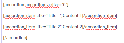
In your text editor, this set of collapsible sections looks like the following:

- The "Accordion_active" field sets whether the first dropdown is open or closed. 0 means it is closed. 1 means it is open.
- The "Title" field is the heading that displays within the drop-down button.
- The Content of your dropdown lies between the open accordion_item and close /accordion_item fields.
You can place any content type between the two accordion_item fields. For example, the following accordion dropdown contains an image:

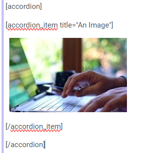
In your text editor, this accordion looks like this:

B - Button
The button content type allows you to create accessible and defined links to external content within a page or book section:This button has no link
In your text editor, this button content looks as follows:

- the link text should be the full html address of your chosen link: link="https://somewebsite.com"
- the link colour can be set via the "type" indicator as follows:
- the button size can be set to "lg", "sm", or "xs" - the default, shown in this list here, is "sm"
You can also use the button feature to create a formatted link text as seen here:
This is a link using button type "link"
In your text editor this content appears like this:

C - Columns
Columns can be used to order content on your page in a stylized but accessible manner. The purpose of using columns, rather than inserting a table for example, is that columns will re-size and re-arrange according to screen size. This makes your content easily readable on all devices and more accessible.
Column content appears on the page as follows:
Column 1 Heading
This is the content of Column 1. This content takes up one third of the width of a standard full width computer screen because it has a weight of "4" and columns should always add up to 12.
Column 2 Heading
This is the content of Column 2. When the browser window is reduced to a medium or small display or when this page is opened on a mobile device, this column will automatically shift down below Column 1, creating a single-column of three rows on smaller screens.
Column 3 Heading
This is the content of Column 3. Note that I have used headings for these columns. This is important to break up the content for viewers so that they can discern the difference between the three columns. Using images here can help as well.
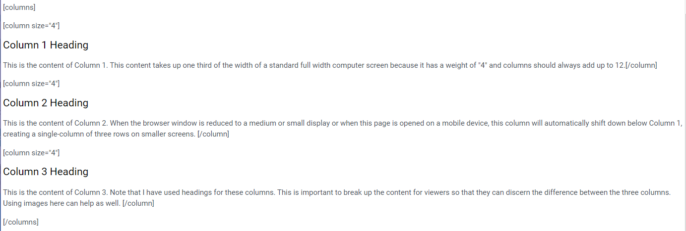
In your text editor - this content looks as follows:

- Columns are mainly styled by width. A common usage of columns is to create a two-column display with an image. When using two-columns, be sure your columns add up to 12.

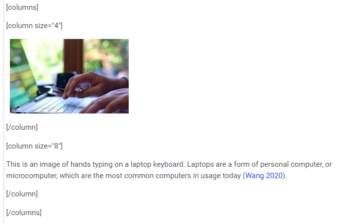
This is an image of hands typing on a laptop keyboard. Laptops are a form of personal computer, or microcomputer, which are the most common computers in usage today (Wang 2020).
In your text editor, this content looks as follows:

H - Header
The header shortcode allows you to style your page or sections of your page with a block header. Please note, these headers are formatted to be H3 or 'medium' level heading text. Be sure to use them in the correct order with your other titles and headings.
This is a Basic Header
In your text editor, the above header looks as follows:

This is a Light Header
This is a Dark Striped Header with no subtitle
This is a Light Striped Header with no subtitle
In your text editor, the headers above look as follows:

These headers are designed to use an image as a background. To use an image, you need to first upload the image file to your media bank. You can do this by inserting the image on to the page and copying the link, then deleting the image.
This is a default (dark) header with a background image.
In your text editor, the above header looks as follows:

The various striped options create a different overlay on your image:
This is a dark striped header with a background image.
This is a light header with a background image.
I - Icons
In general, the COTROnline interface is set up for using FontAwesome 4 icons.
The following information provides best practices for inserting these icons into your content.
To search and locate the icon code you require, please visit the Font Awesome 4 Cheatsheet.
The following Font Awesome icon is a business card image, with the Font Awesome 4 icon code "fa-address-card-o" in the name= field.
In your text editor, this icon appears as follows:

- Unless specified, the icon will take on the size and style of the text it aligns with. For example, when inserted into a paragraph, it will be a paragraph height. If inserted into a heading, it will be the heading text height.
- You can also individually re-size a font awesome icon by setting the "size" attribute to "small", "large" and even "xlarge".
- You can also change the colour of your font awesome icon using the "color" attribute and either a Hex (#000000) code or an rgb (rbg(0,0,0)) color value.
- Some basic colors have automatic values such as "red", "blue", "grey", etc.
Here are some examples:
This icon uses the code name "fa-bookmark." It is styled as size="large" and with a color attribute of "#009aa6" This icon uses the code name "fa-car." It is styled as size="small" and with a color attribute of "#6c6c6c" This icon uses the code name "fa-info-circle." It is styled as size="xlarge" and with a color attribute of "red"Listing icons
Below is the same set of icons using a list format to consolidate and standardize icon alignment and appearance:
- This list item uses the icon name "fa-bookmark."
- This list item uses the icon name "fa-car."
- This list item uses the code name "fa-info-circle."
In your text editor the above icon list appears as follows:

*Note: the extra attribute of "mr-#" delineates spacing to the right of the icon.
- mt-# = top
- mb-# = bottom
- mr-# = right
- ml-# = left
I - Image
The COTROnline Text Editor already provides an insert image function, so why use a shortcode here?
Shortcode attributes will allow you control over the layout on the page, turning images into links, and setting margins. You can also use this function to insert images from elsewhere on the web without downloading them. *But make sure to give proper attribution!

The above image is linked from the accordion page using the image link address as opposed to inserting the image directly into the page.
In your text editor, it looks like this:

S - Slider
T - Tabs
The Tabs feature allows you to present multiple pages of content using a tab format where students can toggle between various tabs to access different information.
When implemented it looks as follows:
In your text editor this feature looks as follows:

Between the tab_item and /tab_item fields, you can insert any content including videos, images, or links. There is no limit to the length of content within a tab.
However, it is best practice to avoid having too much content under a tab as it requires a student to scroll back to the top in order to switch tabs.
V - Video
Most video content in COTROnline is contributed using the Kaltura Media process. However, when inserting images from wider sources, such as youtube, the video shortcode can help simplify the video and avoid creating errors with page layout.
For example:
The code for inserting an external video looks as follows:


